
Dear Reader,
I work as a researcher. One of the things I do at work is performing experiments and drawing conclusions from them. These experiments are usually pretty complicated. Even with projects that seem simple, you need to make decisions early on that may heavily influence the output. And sometimes, after days or weeks of work, when you show the results to someone outside of your team, they point out that one of your assumptions is wrong and you need to start over. Today I would like to tell you a story about how it almost happened to me and more importantly, why and what you can do to avoid such mistakes.
The experiment
Goal of the experiment
We took 25 beacons which were measuring distances between each other (If you don’t know what a beacon is, you can read it up on wiki or check out Estimote webpage). These measurements were to be used later as input to our algorithms. What I want to describe today is the analysis of this data. Our main goal here was to go through the data and check for anything that could potentially be important for the algorithm’s performance — error distribution, missing measurements, outliers, faulty hardware, etc.
Why is this knowledge important for us? Beacons can measure their distance to other beacons and send a message to our phone which tells „Beacon A says its distance to beacon B is 5 m.” Since we are experimenting with new hardware and firmware, we have to check if what beacon A says is really true. Maybe beacon A is malfunctioning? Maybe there is a wall between A and B and it says it’s 5 meters away, but in fact it’s only 1 meter away ? Or maybe all the beacons report the distance that is actually two times smaller than the real one? Or anything that we wouldn’t even think about.
Why is it important? To improve our algorithms, we need to know what’s in the data we use. According to the good old rule „Garbage in, garbage out”, if you work with very inaccurate data you will get very inaccurate results. So we need to make sure that: our data is not garbage we know what we can expect from the data (e.g. errors are rarely higher than 1m)
To sum it up, we started with the following: (x,y) coordinates of all the beacons reported distances between beacons. and our goal was to gather knowledge about the nature of the measurements, existing errors, etc.
IMPORTANT NOTE: All the plots you see in this blogpost are based on data I’ve generated for this blogpost, since I’m not allowed to publish the real data. However, I made sure that it’s similar in every aspect that matters.
Part 1 — error distribution
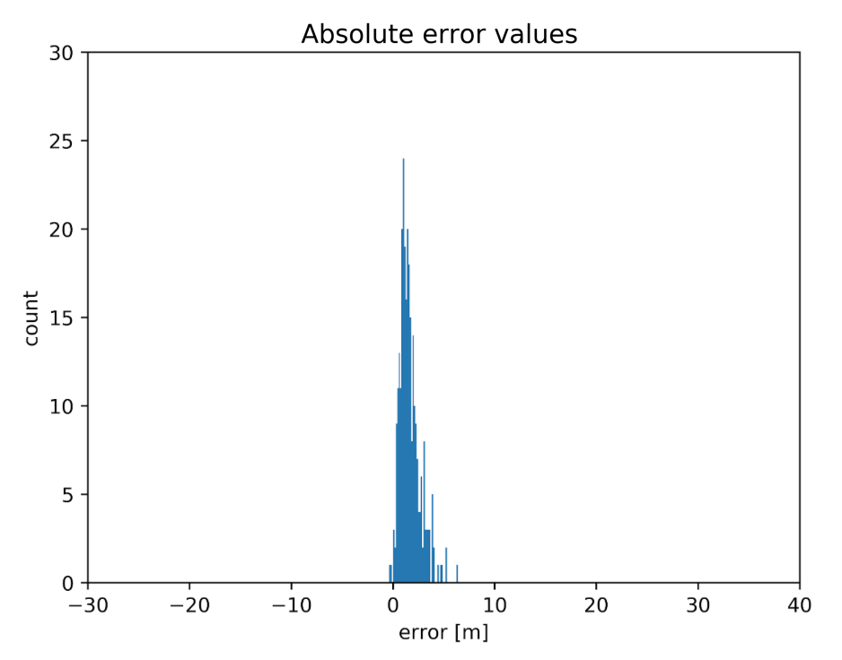
The first question we wanted to answer was “what is the distribution of errors?” So we’ve taken the measured distances, subtracted the real distances and made a histogram of that. You can see the results below:
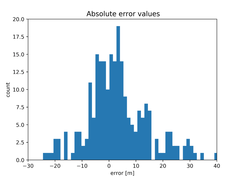
Well… that doesn’t look so good. For these measurements, we had a pair of beacons with an almost 30m error. The size of the space was about 15x30m. What’s more, there were also a lot of negative errors — beacons reported distances that were smaller than the real ones. This was weird. Positive errors are easy to explain — the radio signal can travel through a wall or reflect from the ceiling. In those cases, the path it traveled is longer. But negative distances? One or two would be ok — insignificant outliers. But about 40% of the errors were negative! It seemed like a serious hardware/firmware failure. When we were testing previous iterations of hardware, errors for beacons in the line of sight were one or two orders of magnitude smaller!
There was also this other disturbing plot:
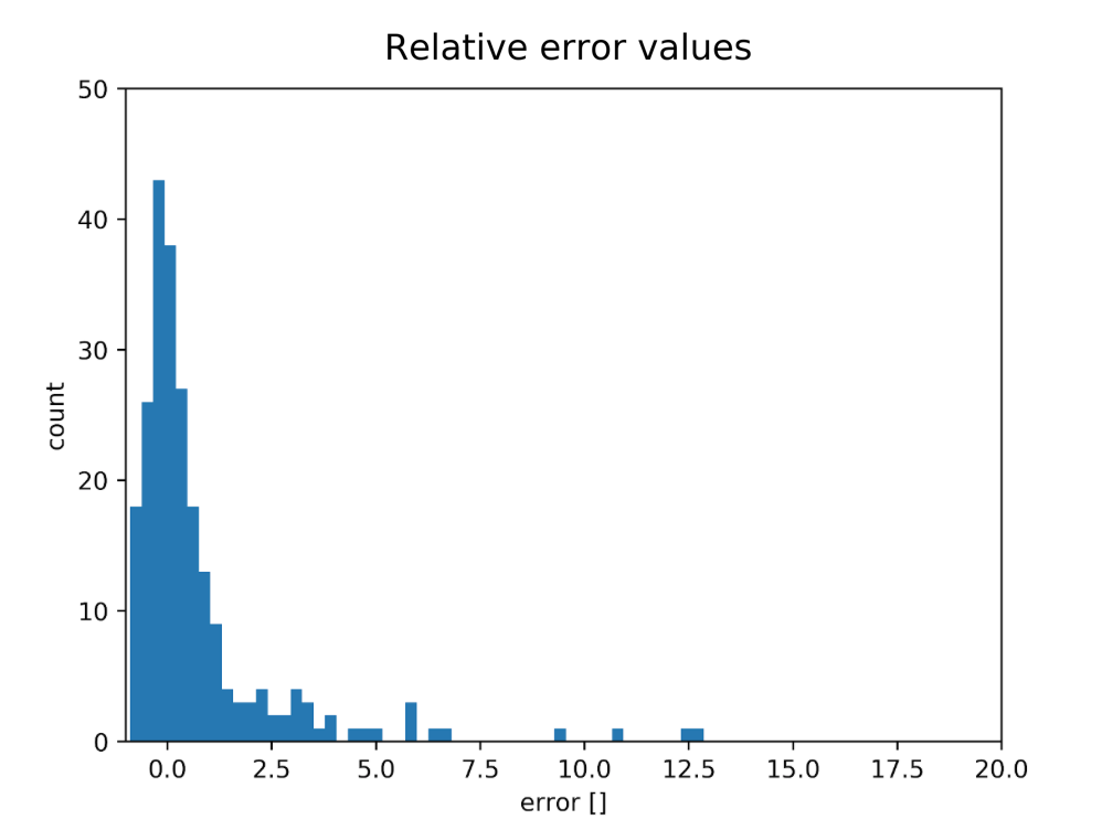
These are relative errors — errors divided by the real distance. And what do we see here? That there is a lot of pairs where the error is bigger than the measured value (even 12.5 times!).
We thought “Ok, there probably are several effects going on here:” hardware bug in some / all devices firmware bug in some / all devices many non line-of-sight measurements some bug in the code (up to this point I’ve made a few mistakes that we have spotted and corrected). some other unknown reasons?
But since we had no idea what was going on, we decided that we have to understand the problem better.
Part 2 — spatial error distribution
We have chosen to see if there are any patterns connected with the spatial distribution. This is one of the first plots we’ve generated to investigate this issue:
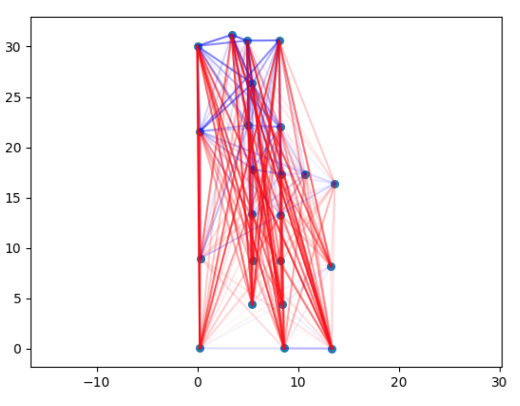
The legend: red — positive errors blue — negative errors The more intense the colour of the line is, the higher the error.
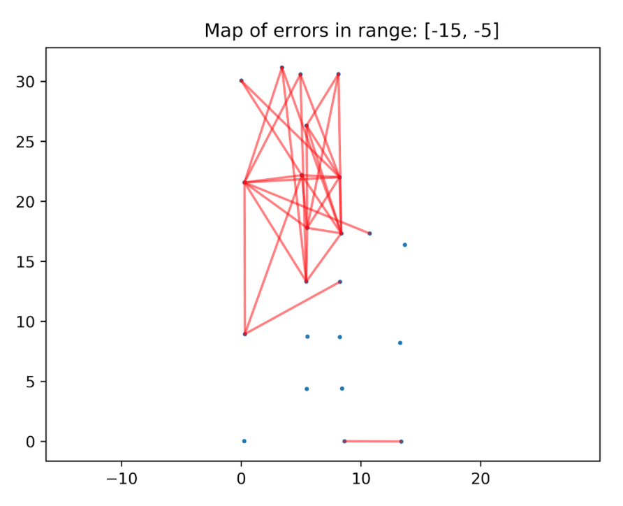
There are too many connections to analyze it thoroughly, but one pattern is clear — the negative connections are mostly in the top of the plot. We have divided this plot into different ranges of errors, to make it easier to analyze. Example:
To make it easier to spot some other patterns, we decided to plot errors per beacon and you can see an example below:
![]()
Even though it has not provided us with the answer, it gave us more insight into the measurements we had. We decided that we know enough about the errors and it’s time to look into some other aspects of the data.
Part 3 — measurements processing
Another place where we looked for the answer was in how we preprocessed raw measurements . For each pair we had multiple measurements, and sometimes we had a measurement from A to B, but not from B to A. We’ve checked lots of things, but let’s look at a single, specific example. We wanted to know if the reported value of the distance for a given pair changes with time. Simply speaking — whether our series of measurements looks like this:
5, 5.1, 5, 5.2, 4.9, …
or rather like this:
5, 8, 4, 5.1, 7, 7.5, …
Since we have used a very simple method of calculating the distance from such series, maybe high dispersion would somehow explain why some errors are so large.
But no, the results were actually very stable. In the vast majority of cases, the standard deviation of the series was under 10 cm — this was not the reason.
Part 4 — revelation
At this point, we had no idea why the errors were so big and why there are so many negative errors. I was working on this with my colleague Marcin. It was the fourth or fifth day of working on this topic and we had more questions than answers. We’ve even printed all the plots and put them on the wall so it was easier for us to analyze them.
With plots on the wall it was easy to talk with people about it, but everybody was just as puzzled by that as we were.
And one day, just as I was about to pack and to go home, Marcin called me to the wall and asked: — “What’s in this plot?” — “All the connections with the absolute error between -20 and -10 meters…”
And then the revelation came to me. Look at this plot and contemplate it for a second.
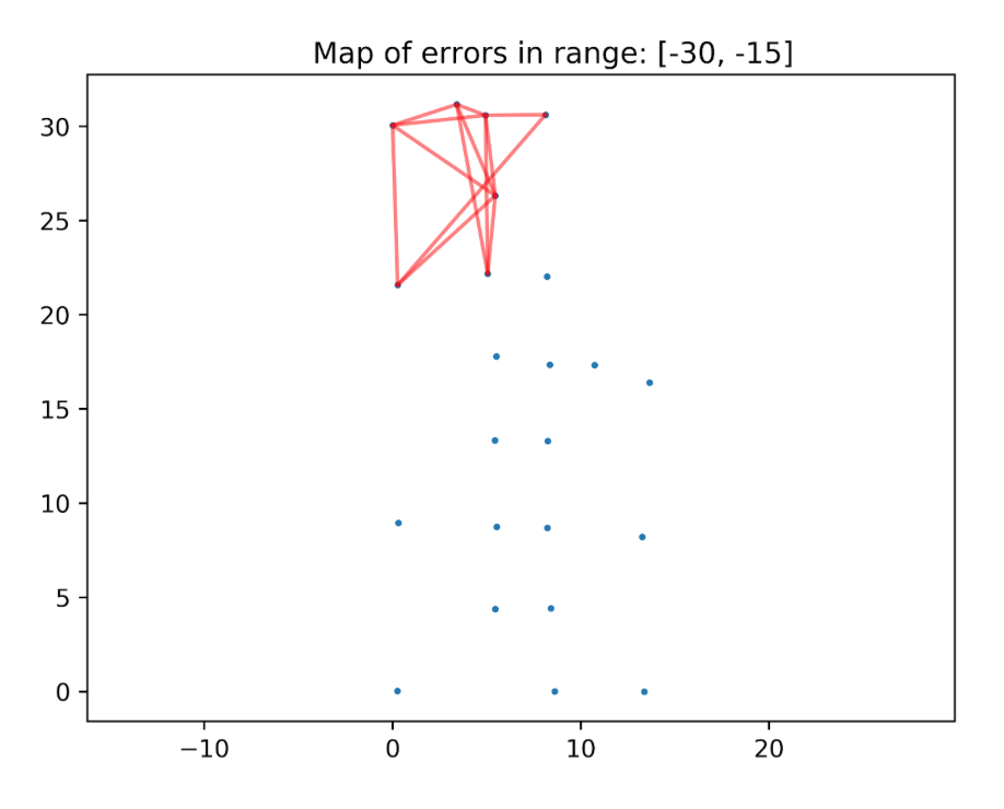
If all the numbers here are in meters, the distance between two top-left beacons is about 5 meters. So if the error is equal to, let’s say, -10m, this means that the reported value was -5m. But we were sure that all the measurements had positive values. At this point I knew what was the problem, I opened my computer, fixed one line in the code. Then I ran the analysis again and this is what I have seen:
![]()
Where was the error? In the following line:
distance = np.sqrt((x_A - x_B)**2 + (x_A - y_B)**2)
This is in the function responsible for calculating the real distance between beacons. The equation for the distance between points A and B is:
As you can see, I have replaced the y_A with x_A. Fixing it fixed all the issues.
Why do I find this story interesting?
It’s fascinating to me that it took us so much time to spot the error and why it happened. We were two intelligent people working in a field we know well, but we were so blind that we have not seen the answer, which was hanging on the wall, literally in front of our eyes for the whole time. One possible explanation is cognitive biases.
Availability bias
Availability bias is the fact that we perceive things that are easier for us to recall as more likely to occur. Let’s discuss about it using our example. Before this project, we had some problems with our devices. They were not working as expected and it turned out there was a bug in their firmware. All in all that was one of the reasons why it took us much more time to make the measurements than we have initially estimated. It was quite frustrating and very vivid in our memory. So when I saw wrong measurements, one of the first things that came to my mind was „there is probably a problem with the devices.”
Now I have a vivid memory of having a stupid bug in my own code. And the next time I approach a mysterious problem, I will be prone to think that the problem is with my code. But that’s wrong, too, because I’m getting into the same availability bias again, this time from the other side. There is no reason for me to think that my mistakes are more likely than other people’s, based solely on the fact that I have recently made a mistake. I will provide some tips how to deal with it later on.
Mischievous patterns aka narrative bias
If what we have seen on the plots was totally random, it would be easy to see that something is wrong. We rarely get total randomness in our results. But as you can see on the plot below, it seems like there is something going on here. As pointed out earlier, blue connections are present in the top area and in the bottom area. This is some kind of pattern. Instead of thinking that it may be a trap, our minds focused on looking for explanations and telling a story. A story of a few malfunctioning beacons or a story of interesting properties of glass (there is a glass wall in the top of the location). The narrative bias is what forces us to create a logical link between two events even if there isn’t enough evidence to support it.
What’s next?
How to avoid making these mistakes?
“To err is human”, but what can we do to cut the risk of similar errors in future? In the previous paragraphs I focused on two specific cognitive biases. Below I present some general good practices which should help with these, as well with others:
General good practices:
-
Don’t compromise the quality of your work based on the pressure of time. In this case — the quality of code. I’ve analyzed a few situations where I failed in the last year and one of the recurring reasons was cutting corners and the pressure of deadlines. So from my experience, the costs of doing something quick & dirty are, in the long term, higher than the benefits.
-
When there is an error/problem, you don’t know the cause and you already spent 15 minutes working on it, try to write down all the possible causes. Even better if you ask for the help some other people and do a quick brainstorm. Then for each cause write down how easy it is to check if that’s the reason and how probable it is that this is the real problem. This will help to fight the availability bias since it forces you to find other roots of the problem than the one that first comes to your mind. It also helps to prioritize your actions better. This approach is similar to the ICE method, which I use for making decisions.
-
Talk about your problems with others. Outsiders usually have a fresh view on the problem and can help to find a solution faster. This is true also for domain-specific problems — sometimes we delve into the details forgetting about the basics, so a voice from the outside can actually help.
-
Talking with others works also as a rubber duck method.
-
Our golden rule is “If you are stuck it means you are not visualizing well.” And it really works like a charm in the vast majority of cases in research and data analysis, but also outside of these domains. Here, it has not helped immediately, but without those visualizations, it would take us much longer to spot the real problem.
-
When you make a decision, ask yourself the question “Why am I doing it? Is there any data to support this view?”. Even better if you write it down and start a decisions-made-journal (more about this approach here).
Books
I’ve touched several topics in this post and if these topics are interesting to you, please check out the following books:
-
Thinking fast and slow by Daniel Kahnemann — probably the best non-fiction book I’ve ever read. The comprehensive overview of the most common cognitive biases written by a man who practically founded this field.
-
Fooled by randomness and Black Swan by Nassim Nicolas Taleb — books about our perception of randomness. Both are among the very best books I’ve read, too.
-
Storytelling with data by Cole Nussbaumer-Knaflic — a book about data visualization. She also has a blog.
As always, I’m more than happy to hear what do you think about this post. You can either write me an email or comment below. And if you don’t want to miss the next post, please subscribe to the newsletter at the bottom of the page.
Have a nice day! Michał